Published on: 17 May 2021
Reading time: 5 minutes
Understanding the Concept of Landing Pages
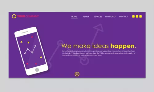
A landing page is one of those pages in a website that helps in enhancing the effectiveness of an advertisement that is run by a particular brand. It is often used for ads that are run on various social media, email campaigns, search engine marketing, display advertising campaigns, and so on. Landing pages are also used to improve the efficiency of ads in high-quality articles as well as affiliate accounts. Such pages aim to convert the visitors into sales, leads or potential customers for the deal of their product, service, and so on. For the same, if you look at some landing page examples, you will find that most of them have a registration or query form or some other sort of call-to-action (CTA) button, using which users can place their inquiry. This method is used when the aim is to generate leads. However, in case if the brand is looking for sales, then a landing page will have a link that will redirect them to the site where they can check the brand’s products and buy them.
Landing pages, in online marketing, are also known as lead capture pages, static page, and squeeze page. It is also known as a ‘single property page’ as it is just a single web page that users can see when they click on the optimised search result of a search engine like marketing promotion, marketing email, online advertisement, and so on. One of the best practises of creating a landing page is to usually show the content, which is the elaboration of the copy shown in the advertisement, link, or search result. The action of the user on the landing page determines the conversion rate of the brand/advertiser. A landing page can also be a part of a microsite that comes within the main website of the organisation.
Inspiring Landing Page Examples for Your Ad Campaigns
It is said that every organisation runs a campaign about their products or services roughly twice a month; it can be more or less depending upon their needs, business growth, and factors alike. At times, when you as a user, scroll through the feed of Instagram, you come across ads that instantly catch your attention; the result of which, you visit the landing page of that particular ad. And, if the landing page design is best and seems to be interesting, you scroll and get intrigued to know more. This is how online marketing works – it starts from an eye-catchy advertisement to the well-developed landing page to finally lead generation or sales. However, between the first and last step – landing pages play a major role. Along with ensuring well-written, appealing content; the design matters a lot. Here are some examples of the inspiring landing pages that can be referred to for your brand’s new ad campaign –
1. Lyft
(https://www.instagram.com/lyft/)
One of the famous websites that let people earn money while they drive their car, Lyft creates landing pages that are simple yet on-point. They usually offer two conversion paths, which helps them address two different sets of users – 1) users who can convert to sales instantly 2) those who need more information before converting into sales. Lyft’s static page is the best design example of a landing page that you can follow.
2. Club W
Another best example of a landing page is Club W. They created a landing page for their corporate gifting section in which they included a catchy caption copy below the header. It helped in improving the brand’s effectiveness, leaving a positive impact on the rate of conversion. It is said that sometimes, catchy banner or title copies can result in lead generation. Of course, for that, a suitable CTA is required. In the case of W, the CTA was ‘Get Started’.
3. Airtory
(https://www.airtory.com/landing-page-builder)
A website that helps in creating rich media display ads, interactive videos, offers landing page builder, and so on – Airtory’s idea of creating their landing pages is to keep it simple but chic. Their landing page has the right amount of information that the user needs to be aware of. Adding to this, in this landing page example, you will see that Airtory offers two conversion paths. While one is the CTA button ‘View Demo’ that helps in giving a demo to the user; the other one is a form that lets the user schedule a demo for the future.
4. SkullCandy
(https://www.instagram.com/skullcandy_india/)
Landing pages by SkullCandy are the best examples of sales static pages. They have attracted users using two methods – 1) where they have redirected the user directly to the shopping site from a social media story or post 2) where they have redirected the user to their social media page for traffic or increasing their engagement. The design idea of SkullCandy landing pages has always been funky and vibrant, enticing the users to check their page/products even more.
What You Need to Consider While Creating a Landing Page?
Other than these four landing page examples, you can also scroll through the social media pages (preferably Instagram) of brands that you like or would like to explore as a user. The key to creating good and responsive landing pages is to think from the perspective of a user – what will attract them, how will they approach, and so on. In addition to this, you have to be very clear about the type of response i.e. leads or sales, you are aiming for. Keeping this factor in mind will help you create some great examples of landing pages for others.
Sometimes, you may aim for lead generation; sometimes for sales. There are also cases, where you can follow two different conversion types like mentioned in two of the examples above. However, what you have to keep in mind is that the landing page has the right content and CTA buttons for helping you achieve the goal. Another best practise for landing pages is that while designing the page, don’t go overboard with the colour scheme or layout – it may affect your conversion rates if the users get confused. You can check for good examples of landing pages that are similar to your business for a better idea.
Having a responsive landing page will help in ensuring excellent conversion rates. So, keep it simple but catchy and let the conversion rate of your ads reach the sky.
Schedule a demo


